Bryan Connor, the editor of The Why Axis, started a gallery at “http://visualizing.org” showing data visualisation on the topic of climate change ranging from sea level rise to energy sources and global temperatures.
He also started a nice collection of visualisations that examine climate change on his own website. It is worth watching!
This post will be rather technical. While reading the book “Data Visualization: a successful design process’” by Andy Kirk, I started questioning whether we can apply his categorisation of visualisation types to scientific visualisations.
The book summarises three main functions of visualisation:
Convey an explanatory portrayal of data to a reader
Provide an interface to data in order to facilitate visual exploration
Use data as an exhibition of self-expression
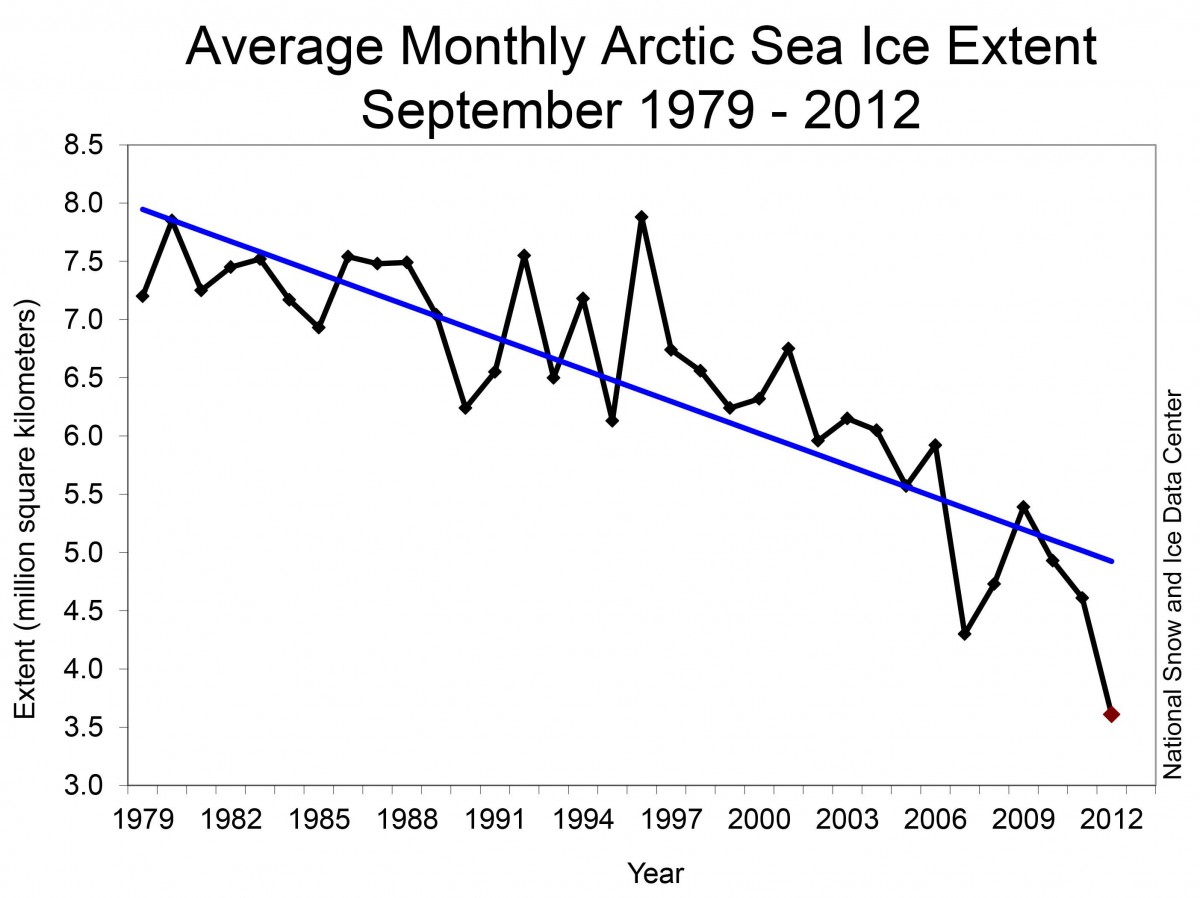
Most of the time, scientific results follow an explanatory approach – their function is to explain. It is about conveying information to a reader. In this example, the decline of sea ice extent:
Example of explanatory visualisation. Taken from the ‘Climate Energy Balance of the Earth’ by Alan Betts (http://alanbetts.com/workspace/uploads/climate-energy-balance-1366392908.pdf)
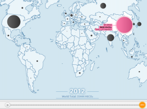
In contrast to the explanatory-based function, the exploratory data visualisation seeks to provide us with a visual analysis instead of just a visual presentation of data. This function is used in science too but more often in the analysis process than for the data presentation. It is clearly a function for scientists to find patterns before publication. These findings require then the use of an explanatory-based visual evidence – which is often a hard step and not always successfully done. However, choosing the exploration form of visualisation means that the scientist needs to come up with a clear portrayal of interesting findings.
Here are two nice examples of exploratory data visualisations of scientific results:
The Global Carbon Atlas is a platform to explore and visualize the most up-to-date data on carbon fluxes resulting from human activities and natural processes:
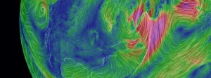
The third function, to exhibit data as a means of self-expression, is very rare in science. It is sometimes referred to as ‘data art’. It aims rather for an aesthetic reaction than for a clear exploration or explanatory portrayal. I would consider the wind and ocean currents by Cameron Beccario as an example of convincing exhibitions-type design of scientific data:
a visualisation by Cameron Beccario of global wind conditions forecast by supercomputers updated every three hours updated every five days. He continuously adds other climate parameters, i.e. relative humidity, air temperature or total cloud water:
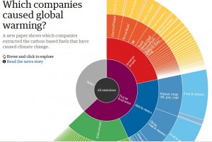
or this hybrid form – an explorative-exhibitation type – by the Guardian showing which fossil fuel companies are most responsible for climate change:
While information accumulation and its visualisation has become a 21st-century obsession, our generation is not the first to discover that a picture is worth a thousand words. I would like to present two scientific examples which document this: a book and an exhibition.
The siblings Uta and Thilo von Debschitz have recently published a unique and fascinating book about the visual world of Fritz Kahn. Fritz Kahn (1888–1968), a physician first by training, was a popular science writer who visualised the structure and function of the human body in a very unique way. Kahn applied his scientific expertise and powerful imagination to create powerful visual metaphors that made sense to those without a technical background. He wasn’t afraid of largely leaving out statistical data analysis to explain how the human body works to a non-scientific audience. Maybe his explanations have become outdated but his strong visual language is still exciting.
The book is carefully curated and filled with images – page after page displays the pioneering work of Kahn’s visual representation of information. His illustratations of systems, cause and effect, and other types of visual stories, enriched with metaphors, can be a source of inspiration for everybody who is interested in the illustrated expression of scientific results.
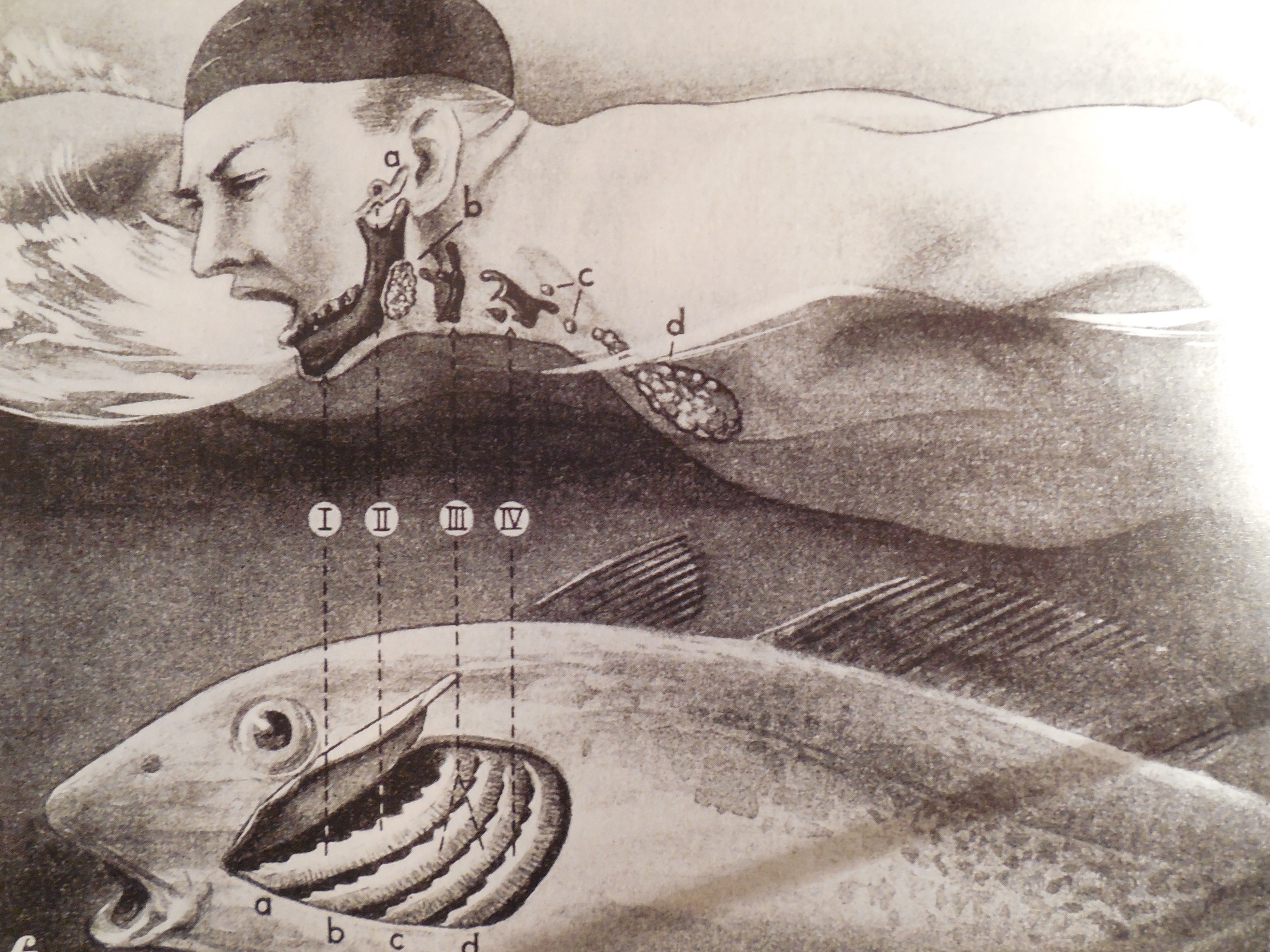
Here is an appetiser from the world of images in the book. Fritz Kahn illustrated the organs of a man’s body as derived from the gills of our fish ancestors: the arches develop into the lower jaw (I), the auditory ossicles (II), the hyoid bone (III) and the throat cartilage (IV), the bays develop into the ear canal (a), the salivary glands (b), the parathyroid glands (c) and the thymus in the chest (d).
Picture and caption taken from the book “Fritz Kahn” by Uta and Thilo von Debschitz
More information about the book can be found here.
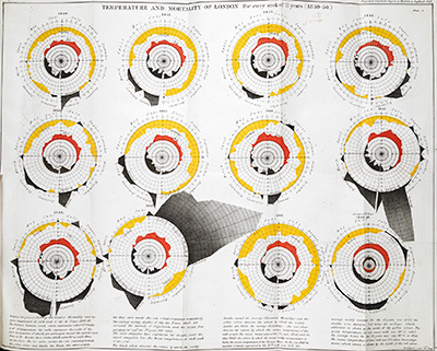
I haven’t been to the exhibtion but I very much like this display of a beautiful visualisation by William Farr that documents in an innovative way the relationship between temperature and mortality in London from 1840-1850.
William Farr Report on the Mortality of Cholera in England 1848-49, 1852. Image and caption taken from http://www.bl.uk/whatson/exhibitions/beautiful-science/.